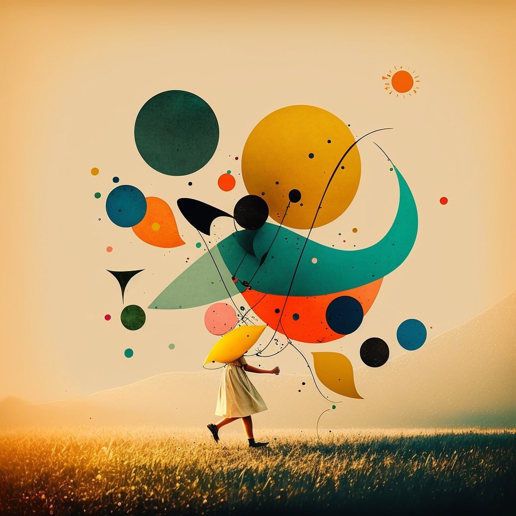
In the vibrant world of graphic design, the interplay between shapes and colors forms the very essence of visual communication. Shapes, with their unique attributes and symbolic meanings, set the foundation upon which colors can either harmonize or create striking contrasts. When combined thoughtfully, these elements can evoke emotions, convey messages, and guide the viewer’s perception in subtle yet powerful ways. For instance, a circle paired with calming blues can suggest tranquility and unity, while the same circle in fiery reds can evoke energy and urgency. Understanding the psychological impact of these combinations is crucial for any designer aiming to create compelling visuals.
Balance of elements
Shapes in design are not just about geometric forms; they encompass everything from organic and abstract figures to the overall structure of a layout. Each shape carries its own connotations: circles often represent wholeness and eternity, squares can imply stability and order, while triangles might denote direction and movement. When these shapes are infused with color, their meanings can shift or become more pronounced. A green square, for example, might communicate growth and stability, making it ideal for eco-friendly brands. Conversely, a black triangle might suggest sophistication and forward-thinking, suitable for a tech startup. The designer’s challenge is to balance these elements to craft a cohesive narrative.
Color theory
Color theory, the backbone of any designer’s toolkit, delves into how colors interact and the effects they produce when paired with different shapes. Warm colors like reds, oranges, and yellows can energize and grab attention, especially when used with dynamic shapes like triangles and zigzags. Cool colors, such as blues and greens, tend to calm and soothe, often working well with rounded shapes or horizontal lines. Moreover, the cultural context of colors can’t be overlooked; a color that signifies prosperity in one culture might have a completely different meaning in another. Thus, designers must be aware of these nuances to ensure their work resonates with the intended audience.
Visual communication
Finally, the combination of shapes and colors must be approached with a sense of balance and hierarchy. A well-balanced design will guide the viewer’s eye, highlight key elements, and ensure the message is clear. This can be achieved through contrasting shapes and colors to create focal points, or through harmonious combinations that lead to a unified look. For instance, using a bold, bright color on a central shape can draw attention immediately, while using softer, complementary colors in the background can support and enhance the primary message without overwhelming the viewer. Effective graphic design is, therefore, a symphony of shapes and colors, each playing its part to create a visually appealing and communicative piece.
An amazing impact
In conclusion, the relationship between shapes and colors in graphic design is a dynamic and multifaceted one. By understanding and leveraging the psychological and cultural implications of these elements, designers can craft visuals that are not only aesthetically pleasing but also deeply communicative. Whether aiming for a bold statement or a subtle message, the thoughtful combination of shapes and colors is key to successful design. So next time you’re working on a design project, take a moment to consider how the shapes and colors interact – you’ll be amazed at the impact they can have.